起源
前两天看到一个面试题,问CSS实现三角形原理,想到以前做过气泡弹出框,气泡弹出框的小角是个三角形,因此对CSS实现三角形原理还是了解的。但是具体实现有些生疏了,因此又实现了一遍。同时注意到,使用Google划词翻译的时候,会弹出气泡框显示翻译内容,激发了我做出这种效果的欲望,可是那时候正在学习其它的东西,就先搁置先来了,不过呢,看来是天意,鬼使神差般把我链接到了medium。并且有下面的情形。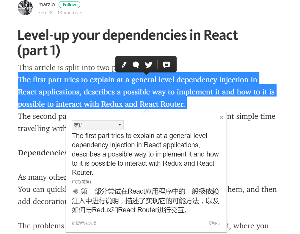
这时就决定做一个玩玩。
过程
弹出框实现
首先我选择了从弹出框入手,以前做过类似的例子,但是弹框气泡头可以向左、向右、向上、向下。在实现的时候需要好好设计。由于自己经验不足,因此参考了bootstrap 上组件的实现。这里只实现了向上、向下的情况。
代码如下:
css:1
2
3
4
5
6
7
8
9
10
11
12
13
14
15
16
17
18
19
20
21
22
23
24
25
26
27
28
29
30
31
32
33
34
35
36
37
38
39
40
41
42
43
44
45
46
47
48
49
50
51
52
53
54
55
56
57
58
59
60
61
62
63 .popover {
position: absolute;
display: block;
padding: 1px;
margin: 0;
max-width: 400px;
background: #fff;
border: 1px solid #777;
box-shadow: 1px 3px 10px #aaa;
border-radius: 5px;
}
.popover>.arrow {
position: absolute;
display: block;
width: 0;
height: 0;
border: 11px solid;
border-color: transparent;
}
.popover>.arrow::after {
position: absolute;
display: block;
content: '';
width: 0;
height: 0;
border: 10px solid;
border-color: transparent;
}
/*弹框显示在指定区域下方*/
.popover.bottom>.arrow {
border-top-width: 0px;
border-bottom-color: #777;
top: -11px;
left: 50%;
margin-left: -11px;
}
.popover.bottom>.arrow::after {
border-top-width: 0px;
border-bottom-color: #fff;
top: 1px;
left: -10px;
}
/*弹框显示在指定区域上方*/
.popover.top>.arrow {
border-bottom-width: 0px;
border-top-color: #777;
margin-left: -11px;
left: 50%;
top: 100%;
}
.popover.top>.arrow::after {
border-bottom-width: 0px;
border-top-color: #fff;
left: -10px;
top: -11px;
}
/*剩下的不写了*/
html:1
2
3
4
5
6
7
8
9
10
11
12
13
14
15
16
17
18<div style="position:relative">
<div style="float:left;position:relative;" class="popover bottom">
<div class="arrow"></div>
<h3 class="title">bottom</h3>
<div class="content">
Lorem ipsum dolor sit amet, consectetur adipisicing elit. Laborum earum rerum, est odit quod eveniet facere facilis! Sapiente
rem minus est numquam aperiam distinctio, suscipit cupiditate vero, maxime, obcaecati nisi?
</div>
</div>
<div style="float:left;position:relative;" class="popover top">
<div class="arrow"></div>
<h3 class="title">top</h3>
<div class="content">
Lorem ipsum dolor sit amet, consectetur adipisicing elit. Laborum earum rerum, est odit quod eveniet facere facilis! Sapiente
rem minus est numquam aperiam distinctio, suscipit cupiditate vero, maxime, obcaecati nisi?
</div>
</div>
</div>
效果:
bottom
top
订制弹框
显示效果如下,可以在该页面尝试。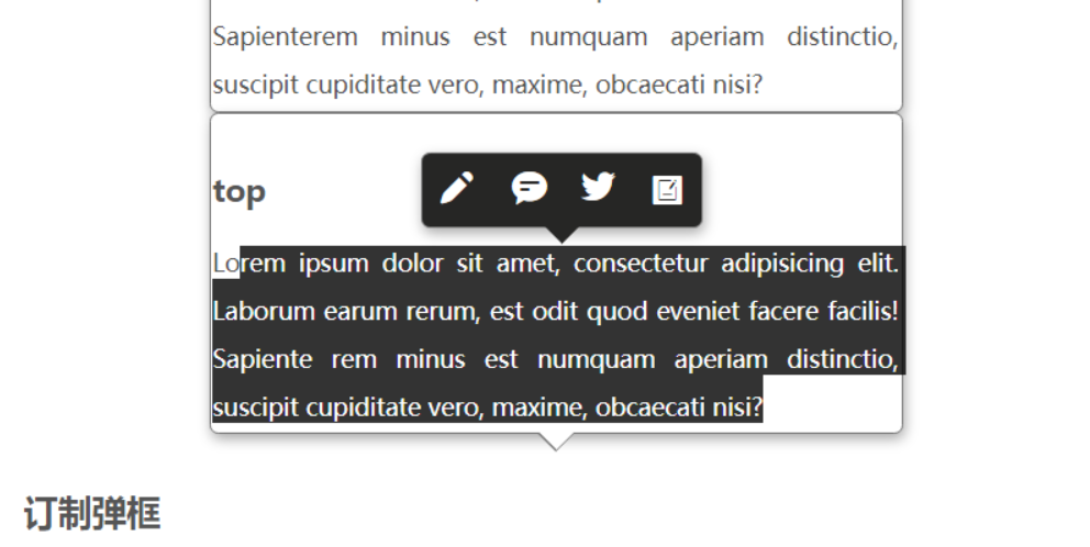
更改箭头颜色1
2
3
4
5
6
7
8
9
10
11
12
13
14
15.popover.bottom.edit>.arrow {
border-bottom-color: transparent;
}
.popover.bottom.edit>.arrow::after {
border-bottom-color: #262625;
}
.popover.top.edit>.arrow {
border-top-color: transparent;
}
.popover.top.edit>.arrow::after {
border-top-color: #262625;
}
创建弹出框,tools.createElement是自己封装的方法。通过审查元素可以看到。1
2
3
4
5
6
7
8
9
10
11
12
13
14
15
16
17
18
19
20
21
22
23
24
25
26
27function createEditPopover() {
var arrowDOM = tools.createElement('div', {
className: 'arrow',
});
var contentDOM = tools.createElement('div', {
className: 'popover-content',
style: { lineHeight: '40px', color: '#fff' },
innerHTML: '<i style="font-size:22px;margin:0 7px" class="iconfont icon-edit1 ">\
</i><i style="font-size:22px;margin:0px 7px" class="iconfont icon-message "></i>\
</i><i style="font-size:22px;margin:0px 7px;margin-top:2px" class="iconfont icon-twitter"></i>\
</i><i style="font-size:22px;margin:0px 7px" class="iconfont icon-wodebiji"></i>'
});
var popoverWidth = 160,
popoverHeight = 40;
var popoverDOM = tools.createElement('div', {
style: {
width: popoverWidth + 'px',
height: popoverHeight + 'px',
top: 0,
left: 0,
userSelect: 'none',
background: '#262625',
zIndex: 2000
}
}, [arrowDOM, contentDOM]);
return popoverDOM;
}
获得选择区域
本以为,获取选择区域及内容可以通过onselect事件获得,测试发现不行,onselect只能作用域文本输入框<input type="text">, <textarea>。要是想获取选择的div内容时,就要用到window.getSelection。参考mdn getSelection,mdn selection,mdn range。获取选择内容很简单。但是要做的是,选中文字的时候,弹框出现在选中文字区域的中心,因此就要获取到选择区域的位置信息。开始的时候没注意range对象的方法,就在Stack Overflow搜到了一个和我现在要做的一样的内容。自己再走前人走过的坑,善用搜索引擎!前往,惊人的相似。
代码如下:1
2
3
4
5
6
7
8
9
10
11
12
13
14
15
16
17
18
19
20
21
22
23
24
25
26
27
28
29
30
31
32
33
34
35
36
37
38
39
40
41
42
43
44
45
46
47
48
49
50
51
52
53
54
55
56function getSelectedTextPos() {
if (window.getSelection) {
var selection = window.getSelection();
var range = selection.getRangeAt(0);
var rect = range.getBoundingClientRect();
//常规浏览器
// {
// bottom: 49.60000228881836,
// height: 20.80000114440918,
// left: 376,
// right: 389.6000061035156,
// top: 28.80000114440918,
// width: 13.600006103515625
// }
return rect;
}
else if (document.getSelection) {
var selection = document.getSelection();
var range = selection.getRangeAt(0);
var rect = range.getBoundingClientRect();
return rect;
}
else if (document.selection) {
var selection = document.selection.createRange();
// selection对象,兼容ie<9
//{
// boundingHeight: 81,
// boundingLeft: 224,
// boundingTop: 534,
// boundingWidth: 309,
// htmlText: "balabalabala..",
// offsetLeft: 222,
// offsetTop: 532,
// text: "党媒:台当局不重视经费仅给5万 武术在台湾快断根山西回应“演唱会损坏足球草坪”:将下“封杀令”国防部回应“建军节阅兵”传言:将适时发布进展"
// }
return {
top: selection.boundingTop,
left: selection.boundingLeft,
width: selection.boundingWidth,
height: selection.boundingHeight,
bottom: selection.boundingTop + selection.boundingHeight,
right: selection.boundingLeft + selection.boundingWidth
}
}
}
function getSelectedText() {
if (window.getSelection) {
return window.getSelection().toString();
}
else if (document.getSelection) {
return document.getSelection();
}
else if (document.selection) {
return document.selection.createRange().text;
}
}
以上代码不适用于<input type="text">, <textarea>。想了些办法都不好实现。要是定位textarea中选中文字位置,思路是:通过onselect事件获得selectionStart和selectionEnd,想办法计算选择文字开始和结束所在的行、输入框中字体宽度以及输入框在文档中的位置,有了这些信息就可以计算选中区域的位置信息,但是很麻烦,而且有点难。想想这种需求不多,如果有这种需求可以使用可编辑div实现,现在一些富文本编辑器应该就是使用的这种形式实现的。
操作逻辑实现
1 | var editPopover = null; |
总结
保持求知欲,不断探索新鲜事物是不断进步的源泉。
附加:
在查看google translate插件html代码的时候发现了shadow-dom,带着疑惑一探究竟。 http://www.cnblogs.com/coco1s/p/5711795.html
如何查看shadow dom?(chrome 58.0.3029.81)f12控制开,找出控制台的setting->preference->element->Show user agent shadow DOM。
看chrome使用的技巧:http://www.cnblogs.com/AloneSword/p/4546935.html。